Brightpod
New Feature — Updated Design for Pods Page
April 15, 2013

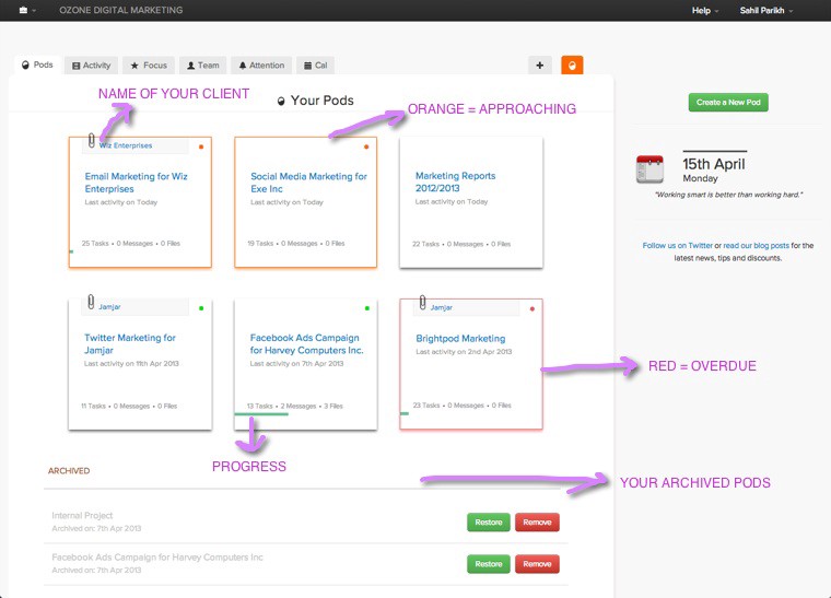
We just updated the Pods page design this weekend. This is the first page you see when you sign in. I personally love the color codes that denote that a Pod is approaching a deadline (in orange) or is overdue (in red). The green dot means that the pod is neither of the two or is ongoing. Archived pods are displayed below in rows.
The new design is much more compact and packed with useful information that you would like to know about your projects without getting into them. Hope you like it :)

Sahil Parikh